A key question regarding the NIH peer review system relates to how well peer review scores predict subsequent scientific output. Answering this question is a challenge, of course, since meaningful scientific output is difficult to measure and evolves over time–in some cases, a long time. However, by linking application peer review scores to publications citing support from the funded grants, it is possible to perform some relevant analyses.
The analysis I discuss below reveals that peer review scores do predict trends in productivity in a manner that is statistically different from random ordering. That said, there is a substantial level of variation in productivity metrics among grants with similar peer review scores and, indeed, across the full distribution of funded grants.
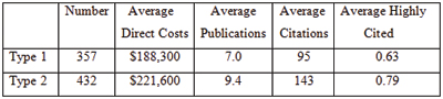
I analyzed 789 R01 grants that NIGMS competitively funded during Fiscal Year 2006. This pool represents all funded R01 applications that received both a priority score and a percentile score during peer review. There were 357 new (Type 1) grants and 432 competing renewal (Type 2) grants, with a median direct cost of $195,000. The percentile scores for these applications ranged from 0.1 through 43.4, with 93% of the applications having scores lower than 20. Figure 1 shows the percentile score distribution.
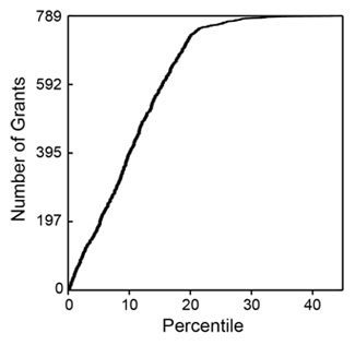
Figure 1. Cumulative number of NIGMS R01 grants in Fiscal Year 2006 as a function of percentile score.
These grants were linked (primarily by citation in publications) to a total of 6,554 publications that appeared between October 2006 and September 2010 (Fiscal Years 2007-2010). Those publications had been cited 79,295 times as of April 2011. The median number of publications per grant was 7, with an interquartile range of 4-11. The median number of citations per grant was 73, with an interquartile range of 26-156.
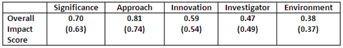
The numbers of publications and citations represent the simplest available metrics of productivity. More refined metrics include the number of research (as opposed to review) publications, the number of citations that are not self-citations, the number of citations corrected for typical time dependence (since more recent publications have not had as much time to be cited as older publications), and the number of highly cited publications (which I defined as the top 10% of all publications in a given set). Of course, the metrics are not independent of one another. Table 1 shows these metrics and the correlation coefficients between them.
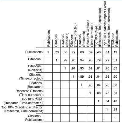
Table 1. Correlation coefficients between nine metrics of productivity.
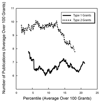
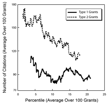
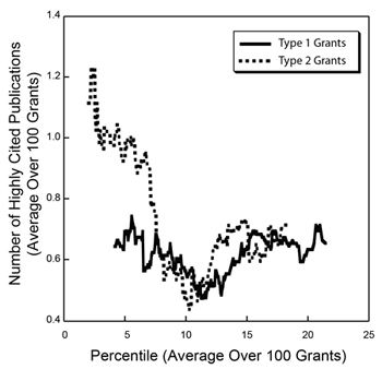
How do these metrics relate to percentile scores? Figures 2-4 show three distributions.
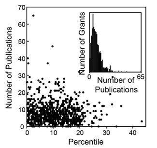
Figure 2. Distribution of the number of publications as a function of percentile score. The inset shows a histogram of the number of grants as a function of the number of publications.
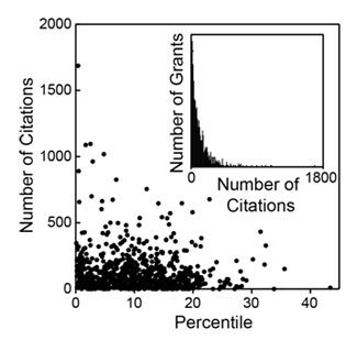
Figure 3. Distribution of the number of citations as a function of percentile score. The inset shows a histogram of the number of grants as a function of the number of citations.
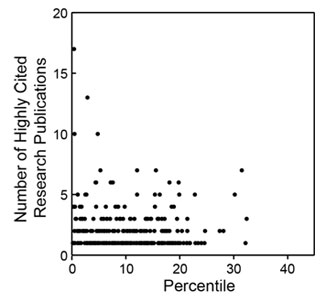
Figure 4. Distribution of the number of highly cited publications as a function of percentile score. Highly cited publications are defined as those in the top 10% of all research publications in terms of the total number of citations corrected for the observed average time dependence of citations.
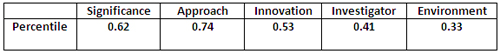
As could be anticipated, there is substantial scatter across each distribution. However, as could also be anticipated, each of these metrics has a negative correlation coefficient with the percentile score, with higher productivity metrics corresponding to lower percentile scores, as shown in Table 2.
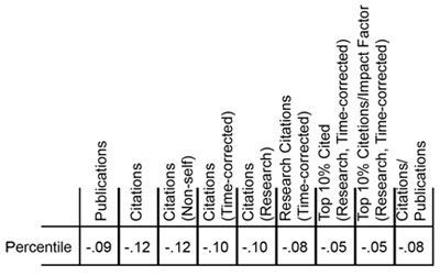
Table 2. Correlation coefficients between the grant percentile score and nine metrics of productivity.
Do these distributions reflect statistically significant relationships? This can be addressed through the use of a Lorenz curve to plot the cumulative fraction of a given metric as a function of the cumulative fraction of grants, ordered by their percentile scores. Figure 5 shows the Lorentz curve for citations.
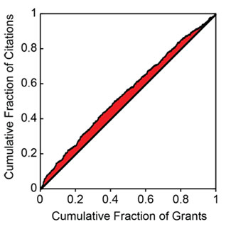
Figure 5. Cumulative fraction of citations as a function of the cumulative fraction of grants, ordered by percentile score. The shaded area is related to the excess fraction of citations associated with more highly rated grants.
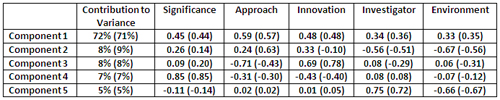
The tendency of the Lorenz curve to reflect a non-uniform distribution can be measured by the Gini coefficient. This corresponds to twice the shaded area in Figure 5. For citations, the Gini coefficient has a value of 0.096. Based on simulations, this coefficient is 3.5 standard deviations above that for a random distribution of citations as a function of percentile score. Thus, the relationship between citations and the percentile score for the distribution is highly statistically significant, even if the grant-to-grant variation within a narrow range of percentile scores is quite substantial. Table 3 shows the Gini coefficients for the all of the productivity metrics.
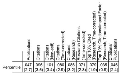
Table 3. Gini coefficients for nine metrics of productivity. The number of standard deviations above the mean, as determined by simulations, is shown in parentheses below each coefficient.
Of these metrics, overall citations show the most statistically significant Gini coefficient, whereas highly cited publications show one of the least significant Gini coefficients. As shown in Figure 4, the distribution of highly cited publications is relatively even across the entire percentile score range.