In a recent post, I presented correlations between the overall impact scores and the five individual criterion scores for sample sets of NIGMS applications. I also noted that the NIH Office of Extramural Research (OER) was performing similar analyses for applications across NIH.
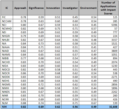
OER’s Division of Information Services has now analyzed 32,608 applications (including research project grant, research center and SBIR/STTR applications) that were discussed and received overall impact scores during the October, January and May Council rounds in Fiscal Year 2010. Here are the results by institute and center:

This analysis reveals the same trends in correlation coefficients observed in smaller data sets of NIGMS R01 grant applications. Furthermore, no significant differences were observed in the correlation coefficients among the 24 NIH institutes and centers with funding authority.


I was just looking at this and some of the preceding posts in this series and it seems like an underlying question is what combinations of criterion scores relate to a specific impact score?
You qualitatively state this issue in your 7/19 post: “For example, an application directed toward developing a community resource may not be highly innovative; indeed, a high level of innovation may be undesirable in this context.” The PCA analysis also hints at this with lower components having negative “Approach” weighting, but it’s always hard to interpret PCA.
The interesting stuff is nonlinear so linear analyses won’t work.
One way I thought to at least visualize what the PCA is showing would start by binning grants by impact score, percentile, or funding status. For example take all grants that are greater than 10th percentile (or funded or unfunded). The x axis would be each individual grant sorted first by their “Approach” scores and then by the “significance” scores. The y axis would show all 5 criterion scores and the impact score. The “approach” line would decrease across x, but what happens to the other 4 criterion lines could be interesting. Does “significance” decrease in sync with “approach” or is it noisy? Are there smooth boundaries or is there some point when the approach score rapidly drops and the innovation score shoots up? Is there any structure to the impact scores within a given range of “approach” score?
Looking at these plots isn’t a quantitative analysis, but they’d give a better idea of the nature of the system.
Very nice. It might be interesting to further this to see if there are any interactions among the individual criterion that influence the corresponding overall impact. (one obvious example is that an application with a great approach also requires an impressive innovation/significance for a good overall score)
good point. i think the approach section would still stay highly correlated and influence the overall application because in most cases, the novelty / innovation / significance lies in the approach. it is like saying, “i want to cure AIDS” is significant, but the “how” part is in the “approach”. so it should stay that way in future.
Was there any significant change in trending between the January and May council rounds? That’s when the application format shortened, but the scoring system remained the same. A comparison of those data may be the best way to measure the effect, if any, of the new application format.
Correction: R01 applications discussed in May council would have been submitted before Jan 25, 2010, under the old 25-page format. So we’ll have to wait for more data to appear before the analysis I suggest can be done.