My previous post generated interest in seeing the results coded to identify new investigators and early stage investigators. Recall that new investigators are defined as individuals who have not previously competed successfully as program director/principal investigator for a substantial NIH independent research award. Early stage investigators are defined as new investigators who are within 10 years of completing the terminal research degree or medical residency (or the equivalent).
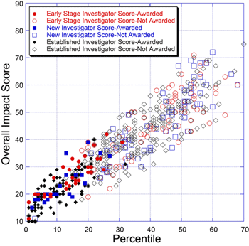
Below is a plot for 655 NIGMS R01 applications reviewed during the January 2010 Council round.

This plot reveals that many of the awards made for applications with less favorable percentile scores go to early stage and new investigators. This is consistent with recent NIH policies.
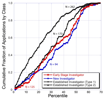
The plot also partially reveals the distribution of applications from different classes of applicants. This distribution is more readily seen in the plot below.

This plot shows that competing renewal (Type 2) applications from established investigators represent the largest class in the pool and receive more favorable percentile scores than do applications from other classes of investigators. The plot also shows that applications from early stage investigators have a score distribution that is quite similar to that for established investigators submitting new applications. The curve for new investigators who are not early stage investigators is similar as well, although the new investigator curve is shifted somewhat toward less favorable percentile scores.


Fascinating!
The scatterplot disproves the canard that borderline NI/ESIs are “stealing” substantial amounts of funding from more meritorious black diamonds. What happened to the poor NI with the unfunded 3 %ile?
In relation to the second plot, is there a difference between the pools in the fraction of applications that are ND?
It is not appropriate for me to comment on particular applications. Recall, however, that new investigators are defined as those who have not received substantial NIH funding. This pool includes investigators at many career stages and is quite diverse with regard to past and current funding situations from other agencies.
I will respond later regarding your second question.
is there a difference between the pools in the fraction of applications that are ND?
The explicit study section rules (IME) to not make NI/ESI investigators disproportionally suffer the triage burden means that there is an artificial distortion in the dataset for this measure.
I am not so sure it would be an informative analysis.
Director Berg, I am surprised that your Institute receives more Type 2 than Type 1 applications. Is this common across ICs? I suppose I usually see numbers for Type 1s that include all of the NI/ESI apps so perhaps that is the reason for my perception.
The total number of Type 1 applications (including those from early stage and new investigators) is approximately 850, while the total number of Type 2 applications is approximately 350.
With regard to the second question, the percentage of each class of application that was discussed was as follows:
Early Stage Investigators: 66%
New Investigators (not ESI) 49%
Established Investigator (Type 1): 50%
Established Investigator (Type 2): 77%
You are to be congratulated for your openness with your IC’s data, Director Berg.
As with the Associate Professors in my department who talked me down out of my grant score rants, I now find myself explaining the “process” to the younger folks in my department and field.
Your provision of the outcome data adds a great deal of support to the points traditionally made by those with study section experience to the newer applicants.
I wish the other ICs would follow your lead in this.
There seem to be approximately 100 solid points on the graph, indicating that about 100 of the 655 applications were funded – am I interpreting that correctly?
There are a substantial number of points with overlapping symbols. More than 210 of the 655 applications have been funded to date.
One of the reasons for keeping the review process humble is that for a given impact score there is approximately a 4-fold spread in percentiles.
I strongly favor an erf(pecentile) type of payline: the higher your score, the more of your budget you get.
Do not drop someone with zero funding (to give someone else more) unless that is the explicit intent. Normalize the scores to fit the current institute budget but spread them out more.
It is not hard to show that the step function threshold is likely to be the most inefficient cost function. Someone going from 5-6 postdocs will not improve as much as someone going from 0-1.
The new funding patterns/review criteria sort of proves that dropping people is perhaps the intent!
Your step function point is very apt, per capita output in larger labs rarely reach those of smaller ones.
Useful stuff. Could you repost the figures in a high res mode, to allow zooming in?
Guntor.
The purpose of this post is to display the overall characteristics of this application pool, not to focus on specific applications. Please let me know if you have specific questions.
Jeremy, it would be great to see similar data for pre-doc and post-doc individual NRSAs: the distribution of impact scores, and color coding of awarded/non-awarded. In the regard, could you explain why it is that NIGMS does not percentile NRSAs?
Director Berg,
Thank you very much for these data. It is hugely illuminating of the process.
Director Berg,
These data are extremely helpful. I am an ESI and trying to learn about the funding system.
I have a perhaps naive question. Do the data include R01’s submitted to all RFAs/PAs/PARs, or only those to PA-07-070? Or in other words, do other RFA/PA/PARs consider ESI/NI status in funding decisions?
Thank you very much!
I wondered if your IC would be willing to break down these results into new and revised applications (A1s and A2s since A2s were likely accepted for this). I am curious how many new investigators get awards on their first submission compared to more established investigators.
Dr. Berg,
Are there any graphics available that sort for established investigators receiving awards by institution (e.g. state funded academic, private academic, research institutes and commercial)? Are there any graphics available that sort between currently funded established investigators receiving awards versus unfunded established investigators receiving awards?