A 2010 analysis by NIGMS and subsequent studies by others (Fortin and Currie, 2013; Gallo et al., 2014; Lauer et al., 2015; Doyle et al., 2015; Cook et al., 2015) have indicated that, on average, larger budgets and labs do not correspond to greater returns on our investment in fundamental science. We have discussed the topic here in A Shared Responsibility and in an iBiology talk. In this updated analysis, we assessed measures of the recent productivity and scientific impact of NIGMS grantees as a function of their total NIH funding.
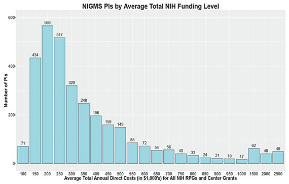
We identified the pool of principal investigators (PIs) who held at least one NIGMS P01 or R01-equivalent grant (R01, R23, R29, R37) in Fiscal Year 2010. We then determined each investigator’s total NIH funding from research project grants (RPGs) or center grants (P20, P30, P50, P60, PL1, U54) for Fiscal Years 2009 to 2011 and averaged it over this 3-year period. Because many center grants are not organized into discrete projects and cores, we associated the contact PI with the entire budget and all publications attributed to the grant. We applied the same methodology to P01s. Thus, all publications citing the support of the center or P01 grant were also attributed to the contact PI, preventing underrepresentation of their productivity relative to their funding levels. Figure 1 shows the distribution of PIs by funding level, with the number of PIs at each funding level shown above each bar.
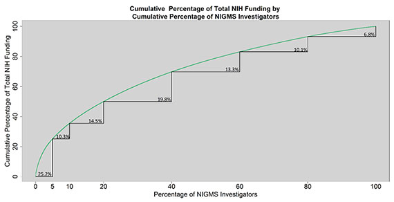
Figure 2 shows the distribution of funding among this group of investigators. The curved green line indicates the cumulative percentage of total NIH funding received by the cumulative percentage of most highly funded investigators indicated on the x-axis. The point (5, 25.2), for instance, shows that 5% of NIGMS investigators receive 25.2% of all NIH funding going to the group we analyzed; similarly, 20% of NIGMS investigators receive 50% of all NIH funding among this group.
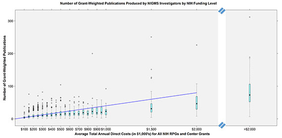
We next examined the productivity of these investigators in terms of publications as a function of total NIH funding. We plotted the number of publications from 2011-2015 associated with an NIGMS investigator’s NIH grants against the average total annual direct costs. We weighted the funding by the number of grants cited in the publication to control for overcounting papers that cite more than one of a PI’s grants and also to control for support provided to a project by other PIs. Figure 3 shows the boxplots of the number of grant-weighted publications for each funding level bin. The teal boxes represent the interquartile ranges, the solid black dots represent the medians and the circles above the boxes represent outliers. The diagonal blue line represents a theoretical line of proportionality in which constant returns are obtained to scale, given the median value of the first bin, so that a doubling in funding results in a doubling of productivity as measured by publications. While the number of grant-weighted publications produced by a PI follows an upward trend, the median of each bin above $300,000 of funding lies below the theoretical line of constant returns to scale. The same is true when publications are not weighted by the number of grants they acknowledge (data not shown).
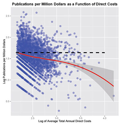
Another way to examine this trend is to look at the number of publications produced per dollar as a function of the amount of funding an investigator receives, which should stay constant if the number of publications produced is directly proportional to the amount of funding received. Figure 4 shows the log of the publications per million dollars plotted for each investigator against the log of that investigator’s average annual NIH funding. The red line is the fitted Loess curve with the 95% confidence interval of this fit shown in gray. The downward slope of the Loess curve indicates a declining rate of publication as the amount of funding increases.
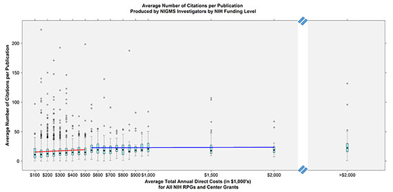
While the data suggest productivity does not follow constant returns to scale, one could also evaluate the overall scientific influence or impact of the publications. To assess impact, we looked at the average number of citations per paper accrued over the period of 2011-2015 for each PI as a function of NIH funding. Figure 5 shows the relationship between citations per paper and average annual NIH funding, which follows a relatively flat pattern, with only a small, discontinuous increase above $500,000. The number of citations per publication produced per thousand dollars decreases as funding increases. Investigators receiving an average annual NIH funding total between $200,000 and $250,000 garner an average of 0.074 citations per publication per thousand dollars of funding. This value falls to 0.04 for investigators receiving between $450,000 and $500,000, 0.03 for investigators receiving between $950,000 and $1,000,000, and 0.01 for investigators receiving between $1,500,000 and $2,000,000.
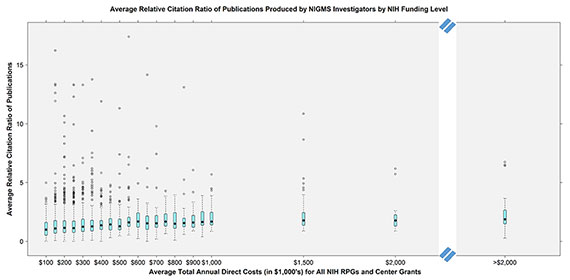
One limitation of using this type of citation count is that different scientific fields have different citation patterns, which raw citation counts do not take into account. For example, a PI in a large field may garner more citations per paper than one in a smaller field simply because of the number of people working in the area, which does not necessarily reflect the importance of the field. To address this limitation, we also analyzed each PI’s average relative citation ratio (RCR) as a function of total NIH funding level. This metric of scientific influence controls for field-specific citation effects, allowing for better comparison across research areas. Figure 6 shows the mean RCR for each PI as a function of total NIH funding level. Again, the data show a relatively flat response in mean RCR with increasing total NIH funding, with a small discontinuity after $500,000.
We conducted these analyses in a number of different ways, with each yielding similar results. In particular, leaving out center funding or investigators who were also supported by HHMI did not alter the findings (data not shown).
Although each of these metrics is an imperfect measure of scientific impact, taken together, the data support the conclusions of the previous studies mentioned earlier: Scientific productivity and impact do not scale proportionally with funding levels. We recognize that some science is inherently more expensive, for example because of the costs associated with human and animal subjects. Furthermore, a few investigators are more productive than the overall trend, with outputs meeting or even exceeding the theoretical line of proportionality in Figure 3. Overall, however, the data suggest that supporting a greater number of investigators at moderate funding levels is a better investment strategy than concentrating high amounts of funding in a smaller number of researchers. This is consistent with an objective of our 2015 strategic plan: Because we don’t know where important discoveries will come from or what lines of research will lay the foundations for them, sustaining a broad and diverse portfolio—in terms of scientific questions, institutions and investigators—is critical for maximizing the impact of the funding available for biomedical research.


Funding greed for NIH dollars is one thing, but this analysis is primarily designed to support a policy in which every NIGMS-funded investigator eventually gets a single R01. The analysis is flawed and fails to measure major impact of groups over the long haul, nor recognize the fact that relatively few people and their papers have major scientific impact over time. It’s pushing a misguided, “one size fits all” policy. There are many elements of scientific quality and output in the analysis that are missing here but it’s not worth even bringing them up because it will not change this bias on the part of NIGMS leadership. I seriously doubt that the Max Planck Society, ETH, or (with time) Chinese science will view things in the same way. Mostly, to me its depressing that my arguably successful NIH-funded efforts over the years do not seem appreciated by NIGMS Leadership.
A wonderful analysis!
Science has been transformed by a process of “businification” (Yuri Lazebnik EMBO reports 16:1592-1600) in which everything is judged based on production. If papers are products, it is not important if they are correct, what is important is if they sell well. This obsession of the NIH with quantification is one of the reasons of the increase in mediocrity and irreproducibility in biomedical sciences.
There are many potential flaws with this analysis that need addressing.
1. I would like to see a demonstration that this exercise uses optimal sampling. The stratification looks like it “stacks the deck” against anyone with higher levels of funding, given the small numbers in many of the bins in Figure 1.
2. The authors confound their analysis by ignoring the missions of grants beyond publication count. There is an extremely important role for education and outreach, which is entirely ignored by this analysis. These goals beyond publication are not optional add-ons, but are actually a requirement for certain funding mechanisms, such as center grants.
3. There is a real sense that this analysis is “blaming the victim” for the administrative burden placed upon grantees by the NIH, a confounding variable ignored here. Reporting requirements are not “flat” on a per-dollar basis, especially when multi-PI funding mechanisms are blended with the more traditionally single-PI mechanisms.
4. This analysis complete ignores the dependence of grantees on the scientific infrastructure of their local environment, much of which may not be funded by federal sources at all (probably the large majority of infrastructure costs benefit the NIH “for free”, i.e. faculty startup costs and cores funded by states and private entities). At the very least, funding through separate mechanisms in the NIH (S10 grants, for example), must be included. Further, funding for personnel may come from many other sources that were not included in the dollar amounts. For example, predoctoral and postdoctoral fellowships may pay a significant portion of the research cost on a given publication. Those dollars are not included here, and would shift grantees to different bins in the distribution. Without accounting for all the dollar amounts that go into each publication, the exercise the authors have carried out is likely to be meaningless.
5. In the bigger picture, the conclusions of this analysis have not been placed in the context of worldwide competition. Investments by other countries in scientific infrastructure required for high-impact science has overtaken that in the U.S. in many fields. A prime example of which I am aware is investment in cryo-electron microscopy. Were it not for investments by private entities and state governments, the U.S. would lag far behind other countries.
Thanks for continuing this very important analysis, and for the commitment of NIGMS to re-focusing attention on the number of investigators funded rather than the number of grants awarded. If we want the US to remain a leader in science, we cannot lose an entire generation of PIs. The bottom line from these and other data is simple: fund more investigators for less money per investigator. The MIRA program is an interesting experiment toward this end.
Number of publications/dollars of funding? When you correlate number of innovative and important
publications/dollar, in a particular research area, then you will be providing us with some useful information.
That would mean that you, as administrators of NIH dollars, know the literature, both new and old, in a
particular field, so you can add weight to publications which truly either initiated or changed the course of
a field of research. In many, but not all, cases you will find that a small lab receiving less funding and publishing less has produced more important (prize-winning) publications. This means that NIH administrators, and scientific review officers, as well as peer review panels, must actually read the research papers that arise from NIH funding. I think that’s the exception, not the rule.
I found the analyses presented interesting and requiring some time to fully digest. But I found the comments for the most part baffling. This is one analysis of one issue that relates to NIGMS funding. No one is setting policy based on the outcome. No one is disparaging small labs, or for that matter large labs. There is absolutely no reason to use this as an opportunity to disparage SROs, study sections, or administrators. I have run a lab of three researchers and with nearly 20 and can personally attest to the fact that the smaller lab was much more productive per person hour or per dollar invested, as salaries eat up such a large fraction of the budget. Of course, it all depends upon the people. Going forward we need all kinds of analyses to help us make the most impactful decisions with a finite budget. I applaud the efforts represented here and look forward to more of them.
It seems that you work better with a small lab then, but you should not imagine that your own experience and management skills apply to others as some general rule. A “one size fits all” policy would be a terribly misguided for funding decisions. I think insightful arguments along the lines of those made by Jamie Cate need to be fully considered by NIGMS (as well as other arguments) rather than mainly looking at graphs and numerology. (BTW, I do not see any comment from anyone here disparaging SROs and Study Sections unless I missed something. As for administrators, questioning or challenging their policies is not the same as “disparaging” them.)
Well said, thank you!
Thank you for your valiant attempt to quantify return on investment!! We need more thoughtful analyses like this one!
I am not even sure that the NIGMS leadership truly believes in this sort of “one scientist-one grant” policy. I believe that the NIGMS leadership is trying to justify policies that are suggested (imposed?) by politicians who want to distribute grants equally to all institutions and all states. Unfortunately, science is one of the few areas where democracy (socialism?) does not work. What it works are competition and merit, but, as mentioned by Joel Rosenbaum, merit is not something the system is capable to judge and recognize.
This is the first time I’ve ever seen this sort of analysis, and I think it’s wonderful to finally have this conversation. I’ve seldom seen a lab where the amount of funding scaled with the science, and I routinely see a lot of waste in the large labs. Sure, there are a few big efforts worth the big investments, but these should be funded through a single grant, not a whole quilt work of overlapping R01s. Thank you for taking a look at this!
Figure 6 actually looks like a nice upward trend from $100k to $1000k, maybe doubling, but this data is described as flat. Am I missing something (with the Y axis stretched it’s hard to tell for sure)?
It’s pretty challenging to interpret data given the question of whether to divide each publication by number of grants cited. This is a very hard problem and an important one given how prominent collaborations are these days. I’m not aware of any good solutions that allow one to properly allocate credit unless you ask authors to assign a percentage of the paper to each grant, upon publication, which is kind of unrealistic logistics-wise.
I agree also with other commenters ignoring the total amount of funding to the lab adds too much noise; that is, it’s nonsensical to compare the output of an R01 to another R01 with three additional ‘free’ postdocs in the lab on their own fellowships. Another hard problem with no decent solution unless the NIH starts publishing data on PIs’ other support.