Tag: Scientific Productivity

Revisiting the Dependence of Scientific Productivity and Impact on Funding Level

13 comments

A 2010 analysis by NIGMS and subsequent studies by others (Fortin and Currie, 2013; Gallo et al., 2014; Lauer et al., 2015; Doyle et al., 2015; Cook et al., 2015) have indicated that, on average, larger budgets and labs do not correspond to greater returns on our investment in fundamental science. We have discussed the topic here in A Shared Responsibility and in an iBiology talk Link to external website. In this updated analysis, we assessed measures of the recent productivity and scientific impact of NIGMS grantees as a function of their total NIH funding.

We identified the pool of principal investigators (PIs) who held at least one NIGMS P01 or R01-equivalent grant (R01, R23, R29, R37) in Fiscal Year 2010. We then determined each investigator’s total NIH funding from research project grants (RPGs) or center grants (P20, P30, P50, P60, PL1, U54) for Fiscal Years 2009 to 2011 and averaged it over this 3-year period. Because many center grants are not organized into discrete projects and cores, we associated the contact PI with the entire budget and all publications attributed to the grant. We applied the same methodology to P01s. Thus, all publications citing the support of the center or P01 grant were also attributed to the contact PI, preventing underrepresentation of their productivity relative to their funding levels. Figure 1 shows the distribution of PIs by funding level, with the number of PIs at each funding level shown above each bar.

Continue reading “Revisiting the Dependence of Scientific Productivity and Impact on Funding Level”

Lab Size: Is Bigger Better?

0 comments

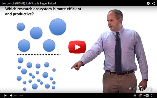
In a new video on iBiology, NIGMS Director Jon Lorsch discusses the relationship of lab size and funding levels to productivity, diversity and scientific impact.

In a new video on iBiology, NIGMS Director Jon Lorsch discusses the relationship of lab size and funding levels to productivity, diversity and scientific impact.

The talk covers information detailed in previous Feedback Loop posts:

Read the Molecular Biology of the Cell paper mentioned at the end of the video for more discussion of lab size and other topics related to maximizing the return on taxpayers’ investments in fundamental biomedical research Link to external web site.

A Shared Responsibility

63 comments

The doubling of the NIH budget between 1998 and 2003 affected nearly every part of the biomedical research enterprise. The strategies we use to support research, the manner in which scientists conduct research, the ways in which researchers are evaluated and rewarded, and the organization of research institutions were all influenced by the large, sustained increases in funding during the doubling period.

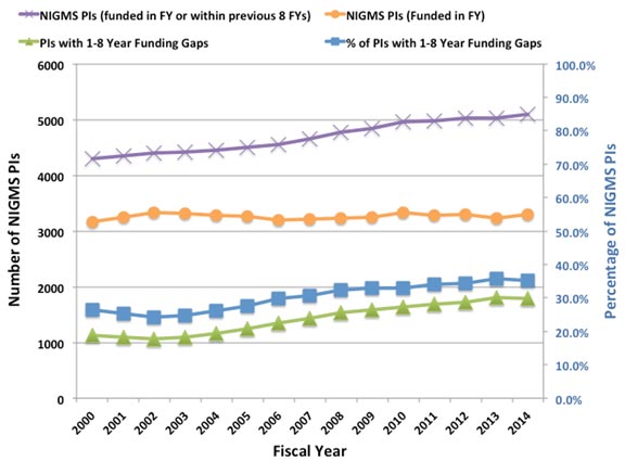
Despite the fact that the budget doubling ended more than a decade ago, the biomedical research enterprise has not re-equilibrated to function optimally under the current circumstances. As has been pointed out by others (e.g., Ioannidis, 2011; Vale, 2012; Bourne, 2013; Alberts et al., 2014), the old models for supporting, evaluating, rewarding and organizing research are not well suited to today’s realities. Talented and productive investigators at all levels are struggling to keep their labs open (see Figure 1 below, Figure 3 in my previous post on factors affecting success rates and Figure 3 in Sally Rockey’s 2012 post on application numbers). Trainees are apprehensive about pursuing careers in research (Polka and Krukenberg, 2014). Study sections are discouraged by the fact that most of the excellent applications they review won’t be funded and by the difficulty of trying to prioritize among them. And the nation’s academic institutions and funding agencies struggle to find new financial models to continue to support research and graduate education. If we do not retool the system to become more efficient and sustainable, we will be doing a disservice to the country by depriving it of scientific advances that would have led to improvements in health and prosperity.

Re-optimizing the biomedical research enterprise will require significant changes in every part of the system. For example, despite prescient, early warnings from Bruce Alberts (1985) about the dangers of confusing the number of grants and the size of one’s research group with success, large labs and big budgets have come to be viewed by many researchers and institutions as key indicators of scientific achievement. However, when basic research labs get too big it creates a number of inefficiencies. Much of the problem is one of bandwidth: One person can effectively supervise, mentor and train a limited number of people. Furthermore, the larger a lab gets, the more time the principal investigator must devote to writing grants and performing administrative tasks, further reducing the time available for actually doing science.

Although certain kinds of research projects—particularly those with an applied outcome, such as clinical trials—can require large teams, a 2010 analysis by NIGMS and a number of subsequent studies of other funding systems (Fortin and Currie, 2013; Gallo et al., 2014) have shown that, on average, large budgets do not give us the best returns on our investments in basic science. In addition, because it is impossible to know in advance where the next breakthroughs will arise, having a broad and diverse research portfolio should maximize the number of important discoveries that emerge from the science we support (Lauer, 2014).

These and other lines of evidence indicate that funding smaller, more efficient research groups will increase the net impact of fundamental biomedical research: valuable scientific output per taxpayer dollar invested. But to achieve this increase, we must all be willing to share the responsibility and focus on efficiency as much as we have always focused on efficacy. In the current zero-sum funding environment, the tradeoffs are stark: If one investigator gets a third R01, it means that another productive scientist loses his only grant or a promising new investigator can’t get her lab off the ground. Which outcome should we choose?

My main motivation for writing this post is to ask the biomedical research community to think carefully about these issues. Researchers should ask: Can I do my work more efficiently? What size does my lab need to be? How much funding do I really need? How do I define success? What can I do to help the research enterprise thrive?

Academic institutions should ask: How should we evaluate, reward and support researchers? What changes can we make to enhance the efficiency and sustainability of the research enterprise?

And journals, professional societies and private funding organizations should examine the roles they can play in helping to rewire the unproductive incentive systems that encourage researchers to focus on getting more funding than they actually need.

We at NIGMS are working hard to find ways to address the challenges currently facing fundamental biomedical research. As just one example, our MIRA program aims to create a more efficient, stable, flexible and productive research funding mechanism. If it is successful, the program could become the Institute’s primary means of funding individual investigators and could help transform how we support fundamental biomedical research. But reshaping the system will require everyone involved to share the responsibility. We owe it to the next generation of researchers and to the American public.

Graph representing NIGMS principal investigators (PIs) without NIH R01 funding between 200 and 2014.
Figure 1. The number of NIGMS principal investigators (PIs) without NIH R01 funding has increased over time. All NIGMS PIs are shown by the purple Xs (left axis). NIGMS PIs who were funded in each fiscal year are represented by the orange circles (left axis). PIs who had no NIH funding in a given fiscal year but had funding from NIGMS within the previous 8 years and were still actively applying for funding within the previous 4 years are shown by the green triangles (left axis); these unfunded PIs have made up an increasingly large percentage of all NIGMS PIs over the past decade (blue squares; right axis). Definitions: “PI” includes both contact PIs and PIs on multi-PI awards. This analysis includes only R01, R37 and R29 (“R01 equivalent”) grants and PIs. Other kinds of NIH grant support are not counted. An “NIGMS PI” is defined as a current or former NIGMS R01 PI who was either funded by NIGMS in the fiscal year shown or who was not NIH-funded in the fiscal year shown but was funded by NIGMS within the previous 8 years and applied for NIGMS funding within the previous 4 years. The latter criterion indicates that these PIs were still seeking funding for a substantial period of time after termination of their last NIH grant. Note that PIs who had lost NIGMS support but had active R01 support from another NIH institute or center are not counted as “NIGMS PIs” because they were still funded in that fiscal year. Also not counted as “NIGMS PIs” are inactive PIs, defined as PIs who were funded by NIGMS in the previous 8 years but who did not apply for NIGMS funding in the previous 4 years. Data analysis was performed by Lisa Dunbar and Jim Deatherage.

UPDATE: For additional details, read More on My Shared Responsibility Post.

Productivity Metrics and Peer Review Scores, Continued

11 comments

In a previous post, I described some initial results from an analysis of the relationships between a range of productivity metrics and peer review scores. The analysis revealed that these productivity metrics do correlate to some extent with peer review scores but that substantial variation occurs across the population of grants.

Here, I explore these relationships in more detail. To facilitate this analysis, I separated the awards into new (Type 1) and competing renewal (Type 2) grants. Some parameters for these two classes are shown in Table 1.

Table 1. Selected=

Table 1. Selected parameters for the population of Type 1 (new) and Type 2 (competing renewal) grants funded in Fiscal Year 2006: average numbers of publications, citations and highly cited citations (defined as those being in the top 10% of time-corrected citations for all research publications).

For context, the Fiscal Year 2006 success rate was 26%, and the midpoint on the funding curve was near the 20th percentile.

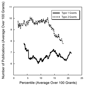
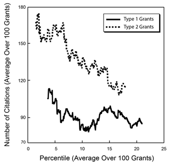
To better visualize trends in the productivity metrics data in light of the large amounts of variability, I calculated running averages over sets of 100 grants separately for the Type 1 and Type 2 groups of grants, shown in Figures 1-3 below.

Figure 1. Running averages for the number of publications over sets of 100 grants funded in Fiscal Year 2006 for Type 1 (new, solid line) and Type 2 (competing renewal, dotted line) grants as a function of the average percentile for that set of 100 grants.

Figure 1. Running averages for the number of publications over sets of 100 grants funded in Fiscal Year 2006 for Type 1 (new, solid line) and Type 2 (competing renewal, dotted line) grants as a function of the average percentile for that set of 100 grants.

Figure 2. Running averages for the number of citations over sets of 100 grants funded in Fiscal Year 2006 for Type 1 (new, solid line) and Type 2 (competing renewal, dotted line) grants as a function of the average percentile for that set of 100 grants.

Figure 2. Running averages for the number of citations over sets of 100 grants funded in Fiscal Year 2006 for Type 1 (new, solid line) and Type 2 (competing renewal, dotted line) grants as a function of the average percentile for that set of 100 grants.

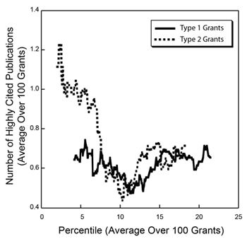
Figure 3. Running averages for the number of highly cited publications over sets of 100 grants funded in Fiscal Year 2006 for Type 1 (new, solid line) and Type 2 (competing renewal, dotted line) grants as a function of the average percentile for that set of 100 grants.

Figure 3. Running averages for the number of highly cited publications over sets of 100 grants funded in Fiscal Year 2006 for Type 1 (new, solid line) and Type 2 (competing renewal, dotted line) grants as a function of the average percentile for that set of 100 grants.

These graphs show somewhat different behavior for Type 1 and Type 2 grants. For Type 1 grants, the curves are relatively flat, with a small decrease in each metric from the lowest (best) percentile scores that reaches a minimum near the 12th percentile and then increases somewhat. For Type 2 grants, the curves are steeper and somewhat more monotonic.

Note that the curves for the number of highly cited publications for Type 1 and Type 2 grants are nearly superimposable above the 7th percentile. If this metric truly reflects high scientific impact, then the observations that new grants are comparable to competing renewals and that the level of highly cited publications extends through the full range of percentile scores reinforce the need to continue to support new ideas and new investigators.

While these graphs shed light on some of the underlying trends in the productivity metrics and the large amount of variability that is observed, one should be appropriately cautious in interpreting these data given the imperfections in the metrics; the fact that the data reflect only a single year; and the many legitimate sources of variability, such as differences between fields and publishing styles.

Productivity Metrics and Peer Review Scores

18 comments

A key question regarding the NIH peer review system relates to how well peer review scores predict subsequent scientific output. Answering this question is a challenge, of course, since meaningful scientific output is difficult to measure and evolves over time–in some cases, a long time. However, by linking application peer review scores to publications citing support from the funded grants, it is possible to perform some relevant analyses.

The analysis I discuss below reveals that peer review scores do predict trends in productivity in a manner that is statistically different from random ordering. That said, there is a substantial level of variation in productivity metrics among grants with similar peer review scores and, indeed, across the full distribution of funded grants.

I analyzed 789 R01 grants that NIGMS competitively funded during Fiscal Year 2006. This pool represents all funded R01 applications that received both a priority score and a percentile score during peer review. There were 357 new (Type 1) grants and 432 competing renewal (Type 2) grants, with a median direct cost of $195,000. The percentile scores for these applications ranged from 0.1 through 43.4, with 93% of the applications having scores lower than 20. Figure 1 shows the percentile score distribution.
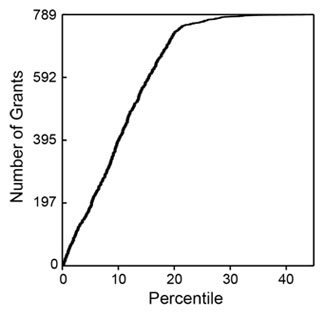
Figure 1. Cumulative number of NIGMS R01 grants in Fiscal Year 2006 as a function of percentile score.

Figure 1. Cumulative number of NIGMS R01 grants in Fiscal Year 2006 as a function of percentile score.

These grants were linked (primarily by citation in publications) to a total of 6,554 publications that appeared between October 2006 and September 2010 (Fiscal Years 2007-2010). Those publications had been cited 79,295 times as of April 2011. The median number of publications per grant was 7, with an interquartile range of 4-11. The median number of citations per grant was 73, with an interquartile range of 26-156.

The numbers of publications and citations represent the simplest available metrics of productivity. More refined metrics include the number of research (as opposed to review) publications, the number of citations that are not self-citations, the number of citations corrected for typical time dependence (since more recent publications have not had as much time to be cited as older publications), and the number of highly cited publications (which I defined as the top 10% of all publications in a given set). Of course, the metrics are not independent of one another. Table 1 shows these metrics and the correlation coefficients between them.
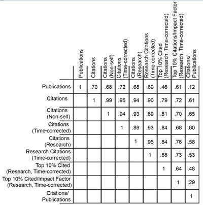
Table 1. Correlation coefficients between nine metrics of productivity.

Table 1. Correlation coefficients between nine metrics of productivity.

How do these metrics relate to percentile scores? Figures 2-4 show three distributions.
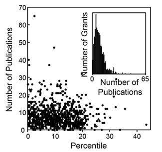
Figure 2. Distribution of the number of publications as a function of percentile score. The inset shows a histogram of the number of grants as a function of the number of publications.
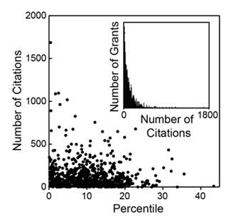
Figure 2. Distribution of the number of publications as a function of percentile score. The inset shows a histogram of the number of grants as a function of the number of publications.

Figure 3. Distribution of the number of citations as a function of percentile score. The inset shows a histogram of the number of grants as a function of the number of citations.
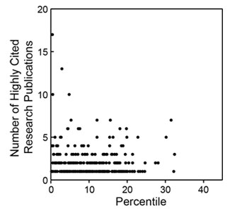
Figure 3. Distribution of the number of citations as a function of percentile score. The inset shows a histogram of the number of grants as a function of the number of citations.

Figure 4. Distribution of the number of highly cited publications as a function of percentile score. Highly cited publications are defined as those in the top 10% of all research publications in terms of the total number of citations corrected for the observed average time dependence of citations.

Figure 4. Distribution of the number of highly cited publications as a function of percentile score. Highly cited publications are defined as those in the top 10% of all research publications in terms of the total number of citations corrected for the observed average time dependence of citations.

As could be anticipated, there is substantial scatter across each distribution. However, as could also be anticipated, each of these metrics has a negative correlation coefficient with the percentile score, with higher productivity metrics corresponding to lower percentile scores, as shown in Table 2.
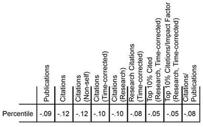
Table 2. Correlation coefficients between the grant percentile score and nine metrics of productivity.

Table 2. Correlation coefficients between the grant percentile score and nine metrics of productivity.

Do these distributions reflect statistically significant relationships? This can be addressed through the use of a Lorenz curve Link to external web site to plot the cumulative fraction of a given metric as a function of the cumulative fraction of grants, ordered by their percentile scores. Figure 5 shows the Lorentz curve for citations.
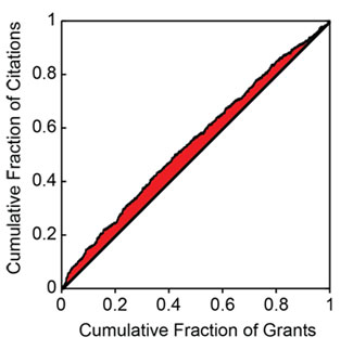
Figure 5. Cumulative fraction of citations as a function of the cumulative fraction of grants, ordered by percentile score. The shaded area is related to the excess fraction of citations associated with more highly rated grants.

Figure 5. Cumulative fraction of citations as a function of the cumulative fraction of grants, ordered by percentile score. The shaded area is related to the excess fraction of citations associated with more highly rated grants.

The tendency of the Lorenz curve to reflect a non-uniform distribution can be measured by the Gini coefficient Link to external web site. This corresponds to twice the shaded area in Figure 5. For citations, the Gini coefficient has a value of 0.096. Based on simulations, this coefficient is 3.5 standard deviations above that for a random distribution of citations as a function of percentile score. Thus, the relationship between citations and the percentile score for the distribution is highly statistically significant, even if the grant-to-grant variation within a narrow range of percentile scores is quite substantial. Table 3 shows the Gini coefficients for the all of the productivity metrics.
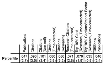
Table 3. Gini coefficients for nine metrics of productivity. The number of standard deviations above the mean, as determined by simulations, is shown in parentheses below each coefficient.

Table 3. Gini coefficients for nine metrics of productivity. The number of standard deviations above the mean, as determined by simulations, is shown in parentheses below each coefficient.

Of these metrics, overall citations show the most statistically significant Gini coefficient, whereas highly cited publications show one of the least significant Gini coefficients. As shown in Figure 4, the distribution of highly cited publications is relatively even across the entire percentile score range.

Another Look at Measuring the Scientific Output and Impact of NIGMS Grants

33 comments

In a recent post, I described initial steps toward analyzing the research output of NIGMS R01 and P01 grants. The post stimulated considerable discussion in the scientific community and, most recently, a Nature news article Link to external web site.

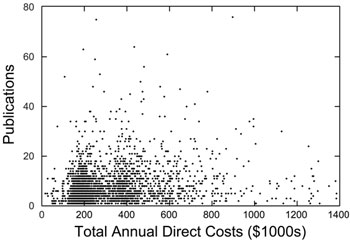
In my earlier post, I noted two major observations. First, the output (measured by the number of publications from 2007 through mid-2010 that could be linked to all NIH Fiscal Year 2006 grants from a given investigator) did not increase linearly with increased total annual direct cost support, but rather appeared to reach a plateau. Second, there were considerable ranges in output at all levels of funding.

These observations are even more apparent in the new plot below, which removes the binning in displaying the points corresponding to individual investigators.

A plot of the number of grant-linked publications from 2007 to mid-2010 for 2,938 investigators who held at least one NIGMS R01 or P01 grant in Fiscal Year 2006 as a function of the total annual direct cost for those grants. For this data set, the overall correlation coefficient between the number of publications and the total annual direct cost is 0.14.

A plot of the number of grant-linked publications from 2007 to mid-2010 for 2,938 investigators who held at least one NIGMS R01 or P01 grant in Fiscal Year 2006 as a function of the total annual direct cost for those grants. For this data set, the overall correlation coefficient between the number of publications and the total annual direct cost is 0.14.

Measuring the Scientific Output and Impact of NIGMS Grants

29 comments

A frequent topic of discussion at our Advisory Council meetings—and across NIH—is how to measure scientific output in ways that effectively capture scientific impact. We have been working on such issues with staff of the Division of Information Services in the NIH Office of Extramural Research. As a result of their efforts, as well as those of several individual institutes, we now have tools that link publications to the grants that funded them.

Using these tools, we have compiled three types of data on the pool of investigators who held at least one NIGMS grant in Fiscal Year 2006. We determined each investigator’s total NIH R01 or P01 funding for that year. We also calculated the total number of publications linked to these grants from 2007 to mid-2010 and the average impact factor for the journals in which these papers appeared. We used impact factors in place of citations because the time dependence of citations makes them significantly more complicated to use.

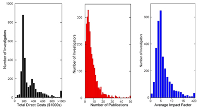
I presented some of the results of our analysis of this data at last week’s Advisory Council meeting. Here are the distributions for the three parameters for the 2,938 investigators in the sample set:

Histograms showing the distributions of total annual direct costs, number of publications linked to those grants from 2007 to mid-2010 and average impact factor for the publication journals for 2,938 investigators who held at least one NIGMS R01 or P01 grant in Fiscal Year 2006.

Histograms showing the distributions of total annual direct costs, number of publications linked to those grants from 2007 to mid-2010 and average impact factor for the publication journals for 2,938 investigators who held at least one NIGMS R01 or P01 grant in Fiscal Year 2006.

For this population, the median annual total direct cost was $220,000, the median number of grant-linked publications was six and the median journal average impact factor was 5.5.

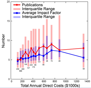
A plot of the median number of grant-linked publications and median journal average impact factors versus grant total annual direct costs is shown below.

A plot of the median number of grant-linked publications from 2007 to mid-2010 (red circles) and median average impact factor for journals in which these papers were published (blue squares) for 2,938 investigators who held at least one NIGMS R01 or P01 grant in Fiscal Year 2006. The shared bars show the interquartile ranges for the number of grant-linked publications (longer red bars) and journal average impact factors (shorter blue bars). The medians are for bins, with the number of investigators in each bin shown below the bars.

A plot of the median number of grant-linked publications from 2007 to mid-2010 (red circles) and median average impact factor for journals in which these papers were published (blue squares) for 2,938 investigators who held at least one NIGMS R01 or P01 grant in Fiscal Year 2006. The shared bars show the interquartile ranges for the number of grant-linked publications (longer red bars) and journal average impact factors (shorter blue bars). The medians are for bins, with the number of investigators in each bin shown below the bars.

This plot reveals several important points. The ranges in the number of publications and average impact factors within each total annual direct cost bin are quite large. This partly reflects variations in investigator productivity as measured by these parameters, but it also reflects variations in publication patterns among fields and other factors.

Nonetheless, clear trends are evident in the averages for the binned groups, with both parameters increasing with total annual direct costs until they peak at around $700,000. These observations provide support for our previously developed policy on the support of research in well-funded laboratories. This policy helps us use Institute resources as optimally as possible in supporting the overall biomedical research enterprise.

This is a preliminary analysis, and the results should be viewed with some skepticism given the metrics used, the challenges of capturing publications associated with particular grants, the lack of inclusion of funding from non-NIH sources and other considerations. Even with these caveats, the analysis does provide some insight into the NIGMS grant portfolio and indicates some of the questions that can be addressed with the new tools that NIH is developing.