
A key question regarding the NIH peer review system relates to how well peer review scores predict subsequent scientific output. Answering this question is a challenge, of course, since meaningful scientific output is difficult to measure and evolves over time–in some cases, a long time. However, by linking application peer review scores to publications citing support from the funded grants, it is possible to perform some relevant analyses.
The analysis I discuss below reveals that peer review scores do predict trends in productivity in a manner that is statistically different from random ordering. That said, there is a substantial level of variation in productivity metrics among grants with similar peer review scores and, indeed, across the full distribution of funded grants.
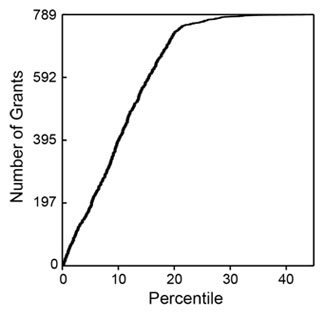
I analyzed 789 R01 grants that NIGMS competitively funded during Fiscal Year 2006. This pool represents all funded R01 applications that received both a priority score and a percentile score during peer review. There were 357 new (Type 1) grants and 432 competing renewal (Type 2) grants, with a median direct cost of $195,000. The percentile scores for these applications ranged from 0.1 through 43.4, with 93% of the applications having scores lower than 20. Figure 1 shows the percentile score distribution.
These grants were linked (primarily by citation in publications) to a total of 6,554 publications that appeared between October 2006 and September 2010 (Fiscal Years 2007-2010). Those publications had been cited 79,295 times as of April 2011. The median number of publications per grant was 7, with an interquartile range of 4-11. The median number of citations per grant was 73, with an interquartile range of 26-156.
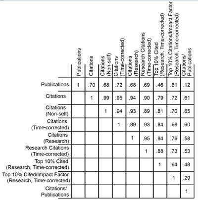
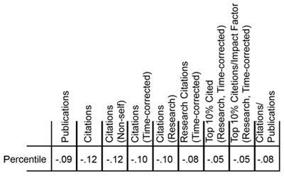
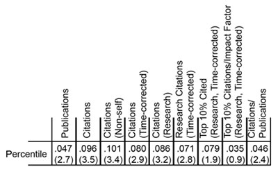
The numbers of publications and citations represent the simplest available metrics of productivity. More refined metrics include the number of research (as opposed to review) publications, the number of citations that are not self-citations, the number of citations corrected for typical time dependence (since more recent publications have not had as much time to be cited as older publications), and the number of highly cited publications (which I defined as the top 10% of all publications in a given set). Of course, the metrics are not independent of one another. Table 1 shows these metrics and the correlation coefficients between them.
How do these metrics relate to percentile scores? Figures 2-4 show three distributions.
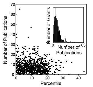
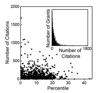
As could be anticipated, there is substantial scatter across each distribution. However, as could also be anticipated, each of these metrics has a negative correlation coefficient with the percentile score, with higher productivity metrics corresponding to lower percentile scores, as shown in Table 2.
Do these distributions reflect statistically significant relationships? This can be addressed through the use of a Lorenz curve to plot the cumulative fraction of a given metric as a function of the cumulative fraction of grants, ordered by their percentile scores. Figure 5 shows the Lorentz curve for citations.
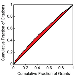
The tendency of the Lorenz curve to reflect a non-uniform distribution can be measured by the Gini coefficient. This corresponds to twice the shaded area in Figure 5. For citations, the Gini coefficient has a value of 0.096. Based on simulations, this coefficient is 3.5 standard deviations above that for a random distribution of citations as a function of percentile score. Thus, the relationship between citations and the percentile score for the distribution is highly statistically significant, even if the grant-to-grant variation within a narrow range of percentile scores is quite substantial. Table 3 shows the Gini coefficients for the all of the productivity metrics.
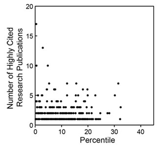
Of these metrics, overall citations show the most statistically significant Gini coefficient, whereas highly cited publications show one of the least significant Gini coefficients. As shown in Figure 4, the distribution of highly cited publications is relatively even across the entire percentile score range.
Jeremy,
Thanks!! Really interesting data.
My impression is that the old adage that a Science, Cell or Nature paper (or a big award/prize/membership) will get you an R01 kind of resonates here. As we all know, once you are publishing in those high impact journals, it is easier to continue publishing in those same high impact journals, to say nothing of the wannabe journals. Thus, a positive correlation with citations is a self-fulfilling prophecy, to some degree. The comparative lack of correlation with publication numbers bears this out, if anything.
Finally, being among the first to have the opportunity to quibble, I suggest all the graphs and analysis end at about the 20th percentile, since the tail down to the 40th doesn’t have enough data to do anything more than cause trouble if you allow it in your calculations and trends.
We will really, really, miss you!!
Steve
Note that, by the design of this study, the papers that were examined were published after the grants were funded. That said, I agree that it is a reasonable hypothesis that preliminary data that contribute to receiving an outstanding peer review score likely lead to high visibility publications shortly after the grant is funded.
With regard to the results for grants that have scores above the 20th percentile, I think it is important to observe that these grants do not appear to be obviously different from other grants in the population with better scores. This bears both on the processes that lead to funding these grants and on the notion that considerable potential productivity is left on the table even with a funding “cutoff” near the 20th percentile.
Very interesting analysis! The bottom line is that there is almost no correlation between percentile ranking and citations. But is there any correlation between funding and citation output? Is there a way in which the citation of funded investigators can be compared with those whose applications were rejected? I suppose, if you pick a few rejected grants at random, and determine the citation for the work (done without funding, or funding from alternative sources) you can get to that issue.
Best,
Sanjay
Looking at productivity from unfunded grants is clearly an interesting and important question but it is very challenging to design a study and obtain sufficient data to address it.
I sure wish there was some other gauge of productivity you could use other than the number of publications/citations. I teach a course with my colleague Mooseker called
Landmark Papers in Cell Biology. This is, of course, hindsight, but they were all picked because they had an influence on the way research in a segment of cell biology
was being conducted today. I do not think that most of us would have a hard time in picking out papers/labs that have, over the past 5 years, contributed “Landmark Papers” to our field. I know I could. And those Landmarks could be from labs that publish only a paper or two/year.
Best,
Joel Rosenbaum
I, too, will miss Jeremy Berg, and I
enjoyed the article on him in this
week’s Science.
I have tried to find other metrics such as the highly cited research papers. These correspond to papers that are in the top 10% of all papers in the sample in terms of the number of citations (time-corrected). These are relatively evenly distributed as noted in the post. Many, but not all, of these papers tend to include methods that have become widely used. The correlation coefficient between this and number of publications is 0.46 so it is clear that some of these papers are coming from labs with relatively small numbers of publications.
Bravo for taking a first stab at such a vital analysis. These data are so urgent and timely at a point where for many institutes and study sections a priority score of 12 or 15 may now be “on the bubble,” and one could only dream of seeing grants funded that were in the 12-20 percentile range. At a policy level, alas, one fears that those inside the NIH will take comfort in the statistical significance while people outside the arena will be struck that, basically, Fig. 2 and 3 show compelling evidence that there is precious little likelihood of a difference between the likely productivity of the 8th – 12th or 13-18 percentile swathes and that of the 0-8 or 3-8 or whatever. [One can only speculate that both the top scores and the outlier type publications correlate best with already prominent, better-funded PIs since the analysis is anonymized, as it should be.]
At a policy level, where this matters greatly is in terms of the debate about the wisdom of losing PIs from science to maintain a system with 4, 5, 6 (etc) RPGs to some investigators.
I wonder what sort of data could *possibly* convince the “NIH peer review is completely broken and corrupt because I can’t get funded” people that NIH peer review actually does a pretty good job?
Interesting analysis, but I think that I must be missing something – if you are not funded or funded less often (average higher scores), you will have fewer publications of any level of impact score because you will not have the money to fund the research to publish!
Additionally, there is likely an unconscious bias to score “superstars” differently (less critically) then those who are not, with the underlying assumption that they will do well no matter what. So, those who are on top tend to stay there, etc.
Often, due to time constraints, many applications are triaged based on the opinions of the few assigned as reviewers and not discussed at all in the general group setting. Triage is a less likely outcome of a superstar application, just because of the psychology behind the process.
While peer review is a good conceptual approach, there are many ways in which it can fall short, especially when new ideas that counter those of the established are put forward. Lots of strong egos in scientific research, and those that are successful are those who are asked to review.
I think that the results of a psychological investigation into the peer review process, if possible, would be quite interesting.
This analysis only includes grants that were funded and the analysis included only publications that were associated with the specific grant.
How far back are you going in counting citations? I have papers that I published 30 years ago that are still being cited more than once a year by other research groups.
The analysis only included papers that were published after these specific grants were funded. These included papers published in fiscal years 2007-2010 with citations through April 2011.
Re: PhysioProf-
Study section service. Seriously. It is time for the NIH to consider a way to get more of the not-yet-successful folks involved so that they can understand the process a little better….
Re Steve-
What? The tail is absolutely critical. Those 30th percentile grants with 5+ highly cited pubs in Fig. 4 are important to the discussion as examples of the imperfect predictive power of peer review
There *was* a way, and it was abolished during “Enhancing Peer Review”. Within a few months of starting as an assistant professor, I was already being asked to serve as an ad hoc study section member. Now that is *extremely* rare.
I also served on study section while still Assistant Professor. At the time there were still a reasonable number rotating in the section as ad hocs. Last overall CSR-wide stats I saw suggested Asst Profs were never more than about 10-11% of all *reviewers* (not of reviews). Then the CSR started minimizing the more-junior folk in response to some poorly defined and essentially unsupported complaining from senior folks who found themselves having to revise their grants for the first time in their careers…
As you know, PP, I think this is a HUGE mistake on the part of the NIH.
Not to mention that it is dramatically discordant with the diversity rules for study section makeup- those demand in every way except for the career status.
I agree that it is a huge mistake in that it (1) makes it even more difficult for younger investigators to master grantsmanship and (2) means that new study section members come in as associate professors who already think they know everything.
Thanks for these comments about study sections, but they are getting us off topic! Please be sure your comment is relevant to the post’s main point.